Remove the AD of Outlook.com with Stylish
Outlook.com is a decent email service by Microsoft. I’ve been enjoying it and its past lives, but sometimes I feel the ad bar annoying…
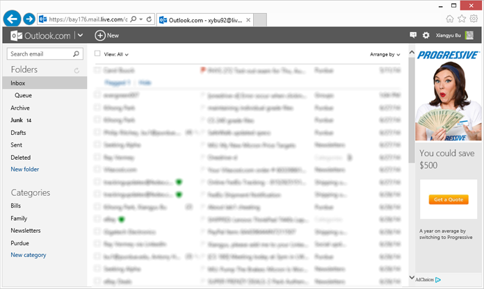
The ad bar is placed as right pane and doesn’t affect usage most of the time. Sometimes it showed interesting stuff. But sometimes it’s not cool. If the screen is not wide enough, the subject column is left with only 5 to 6-char width and the ad remains. Couldn’t MS provide an option to show the ad as a banner at the bottom of the page?

To reclaim space, I created a Stylish script (The script has been uploaded to userstyles.org.):
@-moz-document domain(live.com) {
    #RightRailContainer {display: none;}
    .WithRightRail {right: 0 !important;}
}
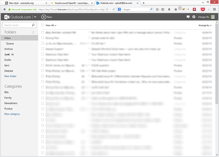
Effect

But again, Outlook.com is an awesome service and if at all possible, don’t kill the ads.
Update for new Outlook.com
Outlook.com recently rolled out new interface which makes the original hack ineffective. The updated CSS hack, in turn, is as follows:
@-moz-document domain(live.com) {
    /* For old Outlook.com */
    #RightRailContainer {display: none;}
    .WithRightRail {right: 0 !important;}

    /* For new Outlook.com */
    ._n_h {display: none; width: 0;}
    #primaryContainer div[style*="right: 165px;"] {right:0 !important;}
}
Because the AD element is neither named nor classified, a slightly complex selector is used. The effect looks like the following:

Update for new Outlook.com Beta (Summer 2017)
The ID and class of the ad DOM are now randomly generated strings. The hack no longer works.